 “Always judge a book by its cover.” – Dave’s dad.
So Broken River Books recently unveiled the cover art for my upcoming novel, The Last Projector, and since it’s gotten such a great response (the cover, I mean) and I’ve fielded more than a few email inquiries about the artist and the strange cover concept, and because Elizabeth White has a great venue for these kinda guest musings I figured I’d throw down some back story for the curious on this artwork’s long, strange journey to completion.
Initially, because of the novel’s obsessions with movies and videos, when J. David Osborne and I brainstormed ideas, we considered a schematic for a film projector, like one of those exploded blueprints, and/or some sort of swirl of videotape. I was also a big fan of Matthew Revert’s cover of Stephen Graham Jones’ The Last Final Girl and how it had those seams on the image to remind people of the traditional “four-sheets” from the heyday of movie posters.
 This started me thinking less about the more obvious “projector” idea and more about movie posters. Because thinking about movie posters is way more fun. So we talked and talked about how we thought movie posters had taken a nosedive as far as creativity, almost always cashing in on the fame of the star with what I called the typical “giant famous head” design (see any Tom Cruise film for examples of this). But before the invasion of the heads, movie posters were amazing.
Also affecting the design was Broken River’s new venture into hardcovers. Mr. Osborne wanted this to be their first hardcover, and thought of this release as more of event, a more collectable work of art. Not to take away from his distinct paperback covers, and the Matthew Revert designs for their first dozen publications which had already made their own splash. He just thought a hardcover should look a little different to justify its existence. And I had fond memories of dust jackets that were almost as action-packed as those movie posters way back when.
Well, maybe some softer scenery, and maybe not quite the heroic poses, but there definitely used to be a lot more going on, wasn’t there? Looking around at my ‘70’s and ‘80’s hardcovers, Pat Conroy’s The Lords of Discipline and The Great Santini had a movie poster feel, I thought, even though it was more respectable heads leading the charge in the image rather than war-torn, cigar-chomping soldiers or grizzled cops. V.C. Andrews covers were fun, too, with those die-cut false fronts and the spooky faces waiting behind them like an evil curtain call, the art casting weird shadows, like they had flashlights under their chins ready to scare you over the campfire. Stephen King’s hardcover for The Shining was a good example, too, although at some point publishers must have realized his name was all they needed.
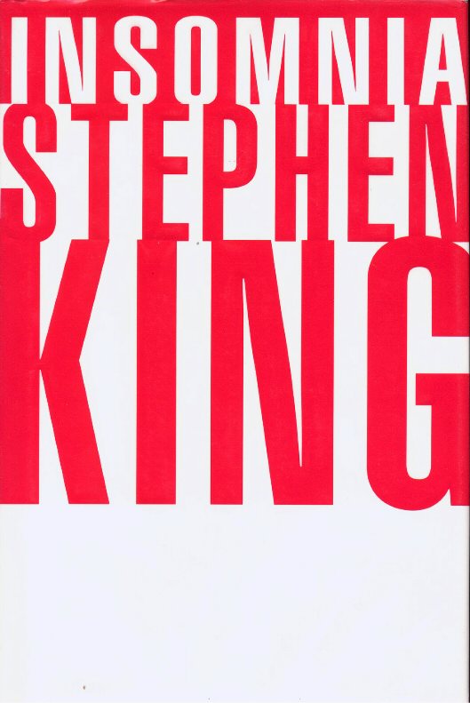
I was working in a bookstore in Toledo when Insomnia was released, and when we saw that cover, we knew it was a harbinger of doom. For the first time, his name was not just bigger than the title of the book, it was bigger than the book period! It was all you saw. Red and white letters going BONG! I wanted it, but I waited for the paperback. It didn’t feel like an artifact worth collecting. It was huge, sure, and could probably be used to secure tents or tarps over tanks, but such an efficient marketing machine was kind of a turn-off. Stephen King’s publishers threw us a bone with the amazing illustrations in The Stand reissue, so maybe it evens out. And the vacations Mr. King takes into Hard Case Crime’s catalog also means some great, imaginative, movie-like covers. But the giant name, giant text, no-art formula is kind of the book-cover norm now.
Sure, they’ll throw the random silhouette against a sunrise or a streetlight, but that shadow could be anybody! From what I’ve heard from sketchy behind-the-scenes sources, even when the name isn’t big enough to carry the entire book on its shoulders, those easily recognizable elements are not a result of laziness. They are chosen specifically as blank slates for the reader to fill with their imagination once they start reading, whether the reading starts on the back cover or deep into the actual book. I was told that they don’t want to risk anyone seeing anything in an artist’s concept of a character or scene that would turn them off of the material before they can buy it. There’s probably some truth to it being difficult to shake an artist’s impression of a character when you start reading, just as it’s hard to shake a particular actor from your brain if you see a movie then seek out the book. So the risk is understandable. But we wanted to risk it.
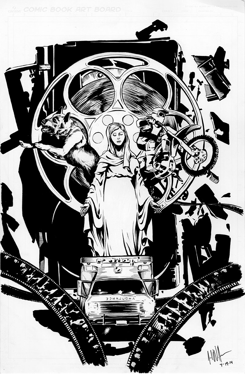
 We steered away from faces though, except for the Virgin Mary, of course, but that was kind of a happy accident. But the kid on the dirt bike doesn’t wear a helmet in the book. However, in the story, it’s very clear that he imagines himself in full Evel Knievel gear. So if any reader wants to fill in that blank, that little punk’s face is waiting for you. I doubt I even described his face, come to think of it. See that? Your imagination is safe here.
But back to movie posters. Love live ‘80s movie posters! My favorites that steered this idea were Big Trouble in Little China, National Lampoon’s Vacation, Raiders of the Lost Ark, and, arguably the main source of inspiration here, the beautifully busy poster for Megaforce.
Maybe it’s a “terrible” movie, but nobody would know that just going by the poster. That was the beauty of advertising back then. Maybe the movie would waste your time, but you’d always have the poster on the wall to take its place in your memory. We weren’t as concerned with the content of Megaforce, which was a typical ‘80s cheesefest with flying motorcycles and splashy lasers and grinning heroes. But that poster. Something about how ‘80’s posters presented the film to you, like, “Hi, we’ll be your action for the evening. See the girl on my arm? See all this crazy shit behind me? I got this.”
And the poster for National Lampoon’s Vacation was a great parody of this poster genre, and although it might not be so successful at what it does, it could be argued that it is completely sincere. The Aqua Teen Hunger Force movie did one, too, with the same artist, making it a parody of a parody, which I think definitely qualifies it as utterly serious.
 So armed with these impossible descriptions, Megaforce imagery, and a terrible sketch by me, four terrible sketches actually, since I was still stuck on the four-sheet concept, we set Joel loose. I’d known Joel Vollmer for a while. Years ago, we worked at the same bookstore, and he would kill time at the information desk drawing me as a gorilla. So I already knew he was great with portraits. Then, later in life, he drew an illustration for my book collection Fish Bites Cop, a cool concept around the sort-of title story – a 1,000 bill with a goldfish on it instead of Grover Cleveland, and the shadow of a football player (you have to read the story “Nine Cops Killed for a Goldfish Cracker” for it to make sense).
But I’d followed his work for awhile, and we were excited to see the possibilities he could come up with. He did rough sketches of two ideas, and he was brainstorming a third concept when we said, “Stop, no need for any more. Go back to that first one. She’s the one.” See, what all of his ideas had in common, and something that hadn’t occurred to us was to make the Virgin Mary statue, a.k.a. “Stone Mary” in the book, the centerpiece of the art. She was the star of Megaforce now, and this is what he came up with once the concept was finally set in stone.
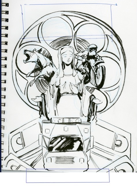
After Joel got his inks done, that’s when the fun started. As I said to him, every email was like Christmas, because the dude just kept coming up with more and more interesting details and flourishes. In fact, the VHS tape spine on the book, something that people were giving me credit for since I’m an avid fan of the Videodrome DVD and its ragged VHS treatment, that was all Joel. He sent an email talking about how he was working on the spine, and we thought, “Okay, but you don’t have to get to spend too much time on that.” And he said, “No, I have an idea. You’re gonna shit.” And it came out brilliant.

After that, when we put it in front of some people and asked, “If you saw this cover, what genre do you think this book would be in?” They said, “Uhhhhh…” Then we asked, “If you saw this cover, what would you think this book was about?” They said, “Uhhhhh…. aliens?” So we asked, “If you saw this cover, would you want to read this book?” And they said, “Yes, please.” Or maybe we said, “Yes, please.” Either way, we knew we were done. So I hope you check it out, and I hope you judge a book by its cover, like we used to. I don’t think there are any aliens in it, but I might have made fun of the Mothman. I can’t remember. But I know I didn’t describe its face.
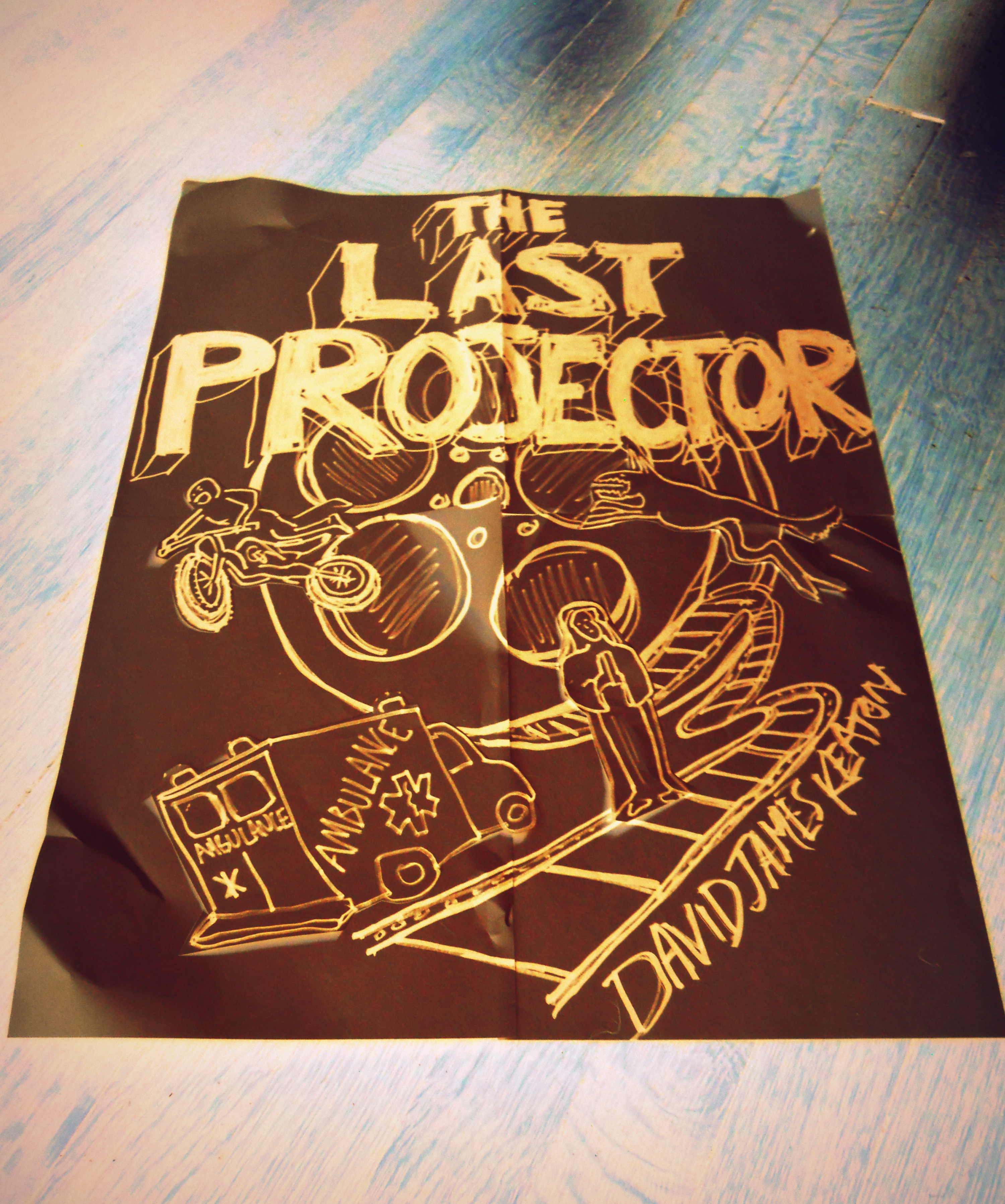
p.s. Recently, my friend Nathan Lamoreau took some time out from bleaching bones to animate the thing in a book trailer. Hopefully, this will hypnotize people…


No comments yet.